
Client: Hacohanim Creative
Services: Event Branding, Print
Role: Lead Designer | Art Director
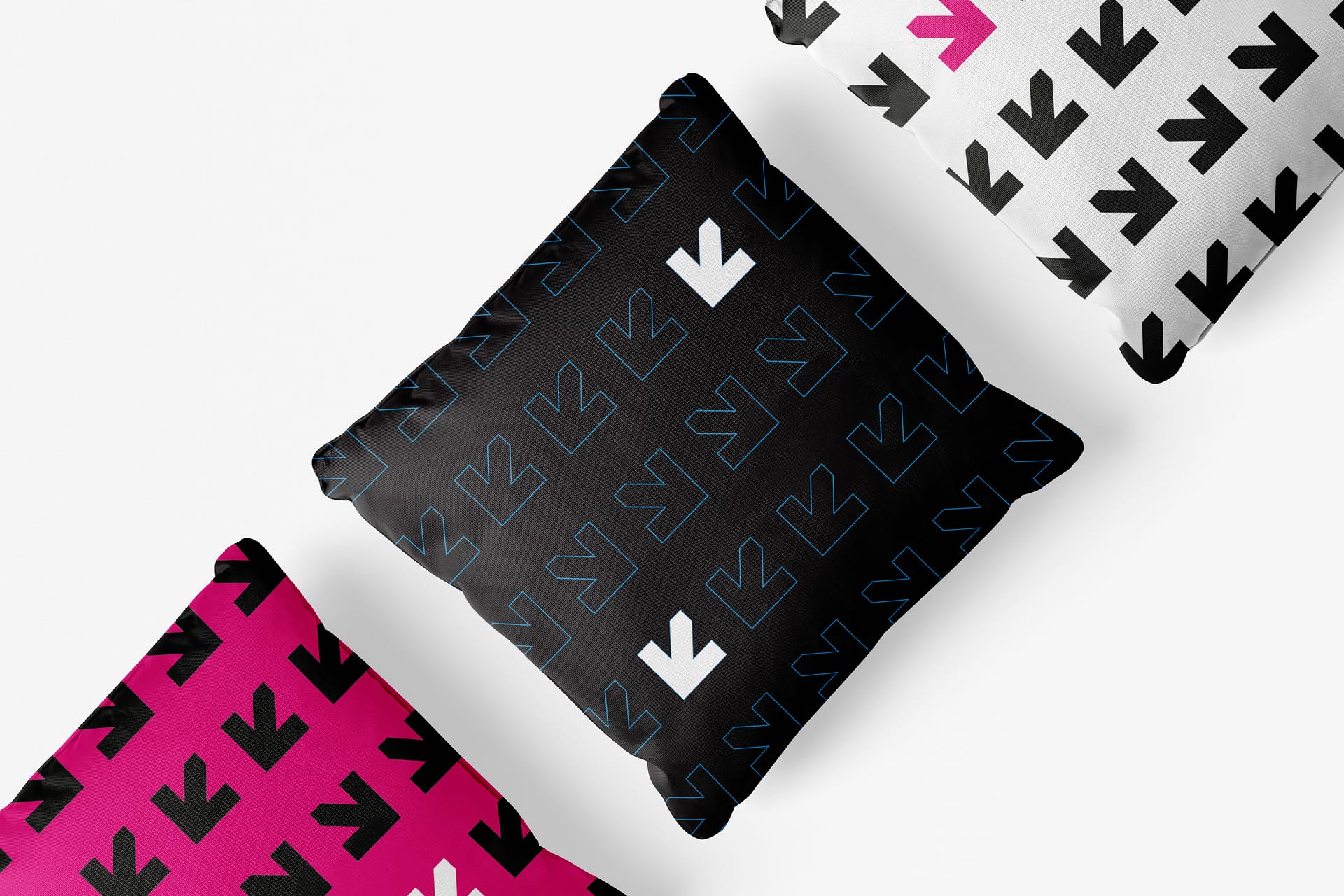
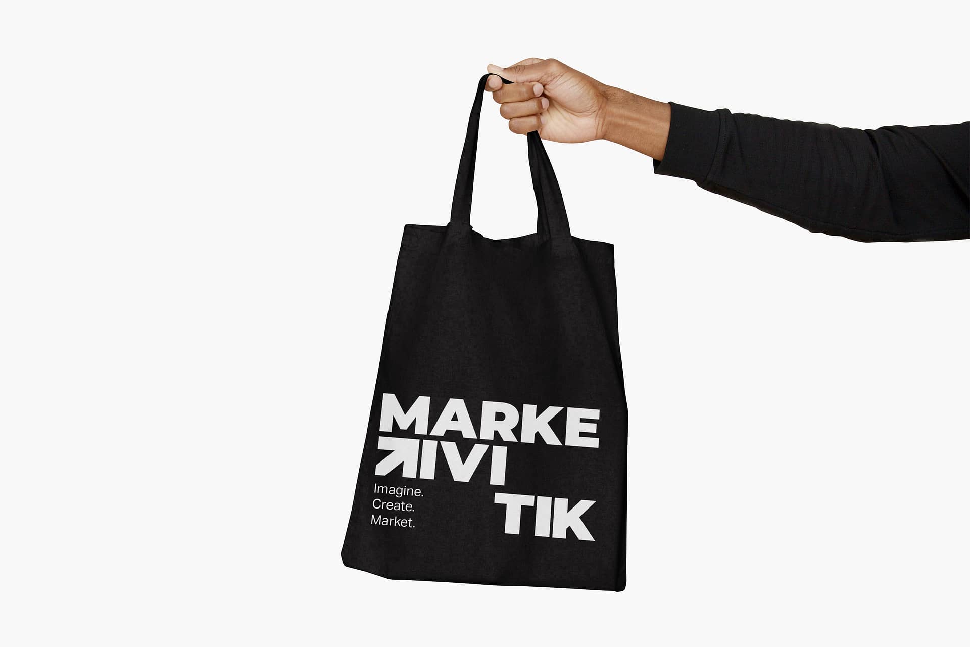
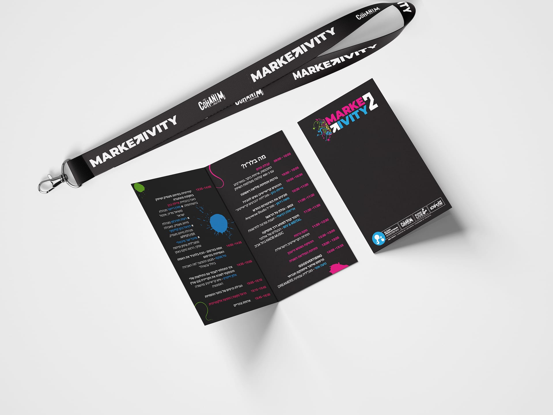
About Project: In the dynamic realm of professional conferences for marketing managers, our team embarked on a project that seamlessly blended creativity with functionality. The conference’s brand identity, dominated by contrasting black, pink, and white colors with a distinctive arrow element, set the stage for an unforgettable experience. The innovative approach extended beyond traditional elements, introducing personalized graffiti-style name tags, chair pillows for comfort, and captivating space branding.
Brand Identity: The brand identity, meticulously crafted in black, pink, and white, aimed for high contrast images that mirrored the dynamic nature of marketing. The arrow element, symbolizing direction and forward movement, became the hallmark of the conference’s visual language, injecting a sense of energy and purpose into every aspect of the event.
Graffiti-Style Name Tags: To create a lasting impression, each participant’s name tag was transformed into a personalized piece of art by a graffiti artist. The keepsake tag not only served its practical purpose but became a tangible reminder of the event, with contact information for both the client and partners discreetly incorporated. This creative yet cost-effective solution added a personal touch, fostering a deeper connection between the guests and the event.
This project exemplifies our commitment to pushing creative boundaries within the constraints of practicality, resulting in a conference that not only conveyed professionalism but also left a lasting impression on participants. The fusion of vibrant brand identity, personalized keepsakes, and thoughtful space branding elevated the marketing managers’ conference into a uniquely immersive and unforgettable event.
As part of working in the Hacohanim Creative Studio
More Projects
Biktat Aor Home Page
- Web Design
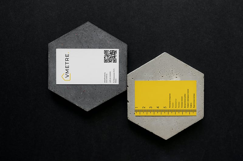
Vmetre Business Card
- Graphic Design, Print & Packaging
Omer Gefen Logo
- Brand Identity